‘Floating Life’ Promotional Campaign
This team project was all about forming a promotional campaign for a hypothetical SBS TV adaptation of Clara Law’s film ‘Floating Life’. My role within the team was the ‘Design Assistant’ and I was responsible for creating the visuals and constructing the face of the campaign.

Development
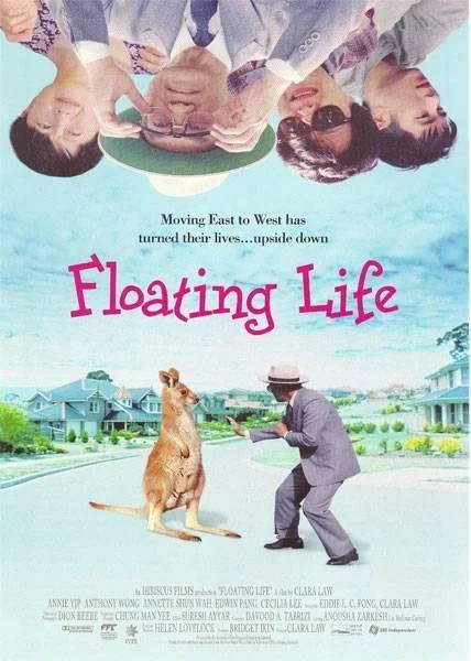
Taking a look at the original film poster, I enjoyed the quirkiness of the characters being placed upside down as it hints to the elements of humour in the film. I can also recognise that the suburban imagery is over-exposed to allude to the starkness of new housing estates in Australia. Whilst I was not so keen on the use of pink in this poster, I liked the blue background which I then determined would be maintained in the promotional design to create some familiarity between the film and the new tv series.
What I was hoping to elevate was the typography and overall visual style, ultimately aiming to produce something that is more modern and clean.
I appreciated the kangaroo in this poster and decided that I was also going to feature an animal to be cohesive with the film. I recall the dog in the film being a humorous motif which on a deeper level represented the confrontation and fear that comes with adjusting to a new home. The decision to include the dog greatly benefited my team’s final outcome as it added a distinct and recognisable element to the campaign.

Style Guide
The next stage of the project involved developing a style guide to ensure consistency across the team’s visuals. I took initiative in creating this guide, helping to align our visual identity and guarantee a cohesive promotional campaign. I believe this demonstrated leadership as it set an example to the team as to how they can also contribute their own expertise and ideas (Raappana and Horila, 49, 2019).
My style guide focused on colour, typography and photography as key elements of the promotional design. I aimed for clean and simple visuals whilst referencing the blue In the original movie poster. The contrasting blue and orange creates an interesting a sense of starkness, yet together with the varying shades evoke a nice warmth, reflecting some of the more touching elements in the story.
After discussing my use of photography with my social media team members, we agreed upon capturing nostalgic Asian-Australian spaces such as grocers, restaurants and China town. This was a great example of shared decision-making within the team as we were able to combine our knowledge to determine the best outcome for the campaign (Raappana and Horila, 50, 2019). I then contributed the photos of Australian suburbia to showcase the juxtaposition between the life the characters left and the one that they are now adjusting to.

Poster Design
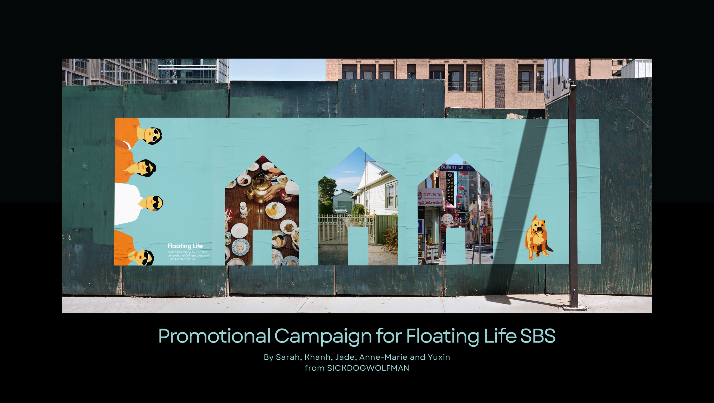
My poster design carries through the quirkiness of the original poster and translates it into a modern, clean and illustrative redesign. I have kept the layout simple with more of a focus on the characters and their dynamic as a family. I see this poster as a depiction of the characters staring into the bright Australian sun, drawing upon their adjustment to their new lives in a new country.


I then incorporated the TV series poster into a larger public spread, one that captures peoples attention as they walk past and showcases the key themes without them having to look too closely. Here is where I introduce the dog who equally resembled a humorous moment in the film and a representation of the fear that the family felt whilst adjusting to Australia. I saw this dog playing a larger role in the design of the promotional campaign as I found it to be one of the more memorable elements of the original film. I also introduce in these posters the house shape which highlights the central theme of home and where that exists for the characters, ultimately drawing upon a very real and relatable struggle for many. I incorporate photography to showcase snippets of the story as well as to depict some of the elements that may resemble home for the characters.
I can see the public walking past these posters and being able to identify the title, the themes, the characters and then the viewing platform where the series can be watched.
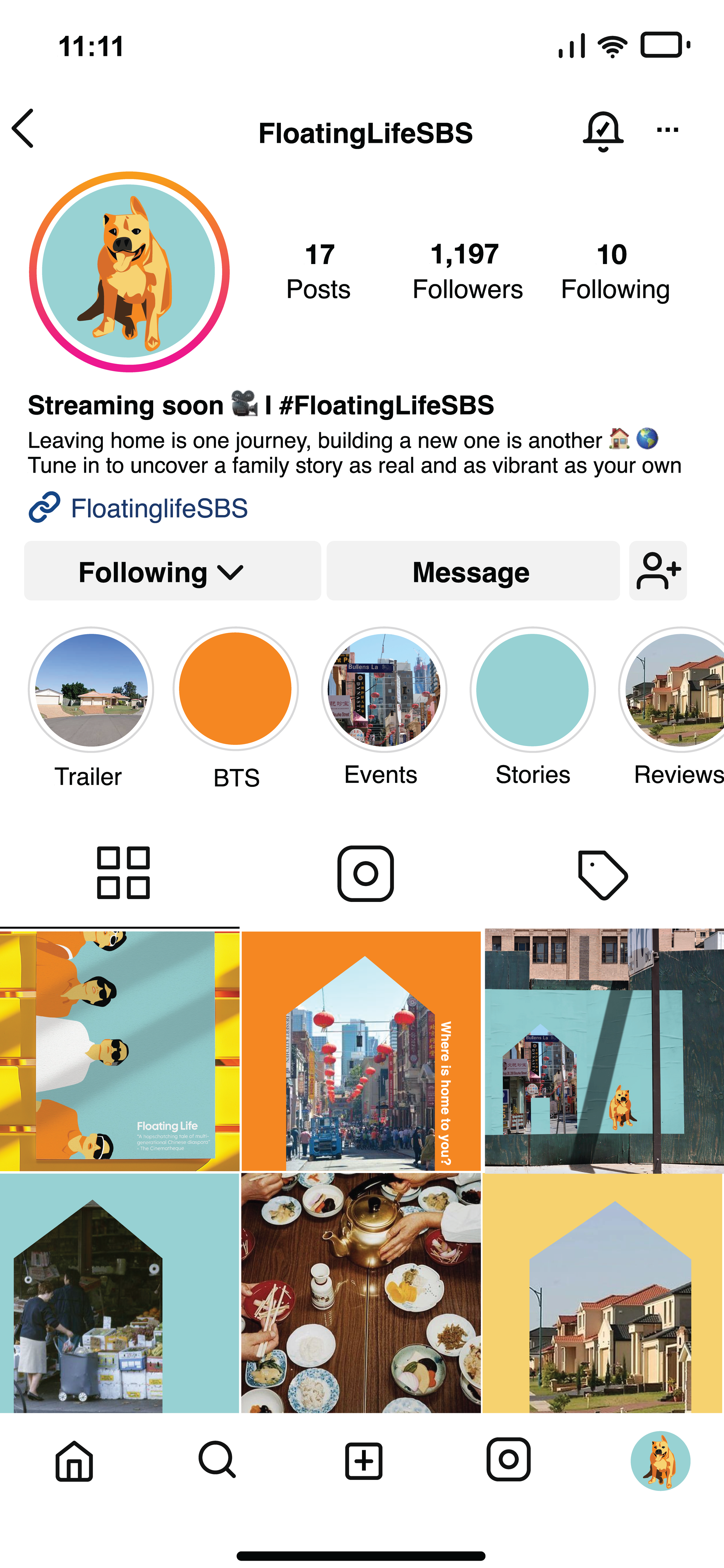
Social Media Design
Working closely with my social media teammates, my role within the social media profile design was to create engagement, highlight the hashtag and prompt conversation in the comments. I utilised my style guide to create a colourful and bright social media profile that is recognisable alongside the posters. I maintain the house motif through the feed, including questions about home and what that means to the people navigating the page.
I visualise this profile drawing in younger audiences which will allow for the show’s exposure and target audience to broaden.
I feel that social media design is best kept simple, hence why I utilised the dog as a profile picture which I think also reinforces its position as a recurring motif of uncertainty and newness throughout the story.
I also incorporated my writing abilities to generate some strong copywriting for the profile bio which I believe to be an essential component of any promotional design.

SBS Website Design
Whilst adhering to the design guidelines of the SBS OnDemand website, I designed a mockup of what the television adaptation would look like within its designated streaming platform. Maintaining SBS OnDemand’s use of gradients and specific typefaces, I incorporated photography, my primary font and some copywriting to make the promotion consistent with what exists outside of the platform.
Presentation Design


Buckingham, Marcus, and Ashley Goodall. “The Feedback Fallacy”. Harvard Business Review, vol. 97, no. 2, Mar. 2019, pp. 92-101, https://search.ebscohost.com/login.aspx?direct=true&AuthType=shib&db=bth&AN=134854851&site=ehost-live&scope=site&custid=s8849760.
Chesebro, Joseph L.. “Giving Good Presentations” Professional Communication at Work, Taylor & Francis Group, 2014, pp. 251-263. ProQuest, https://ebookcentral.proquest.com/lib/monash/detail.action?docID=1744157
Raappana, Mitra and Tessa Horila. “Team Communication in The Workplace.” Workplace Communication, Taylor & Francis Group, 2019, pp. 44-58. ProQuest Ebook Central, ebookcentral.proquest.com/lib/monash/detail.action?docID=5981720.
Scanlon, Lesley. “‘Becoming’ a Professional'“. Becoming a Professional, Springer Netherlands, 2011, pp. 13-32. https://doi.org/10.1007/978-94-007-1378-9_1.